How to Read Crypto Candlestick Charts: A Beginner's Guide
Candlestick charts pack open, high, low and close into a single shape. Learn to read the body, wicks and colour, plus a few common patterns in plain terms.
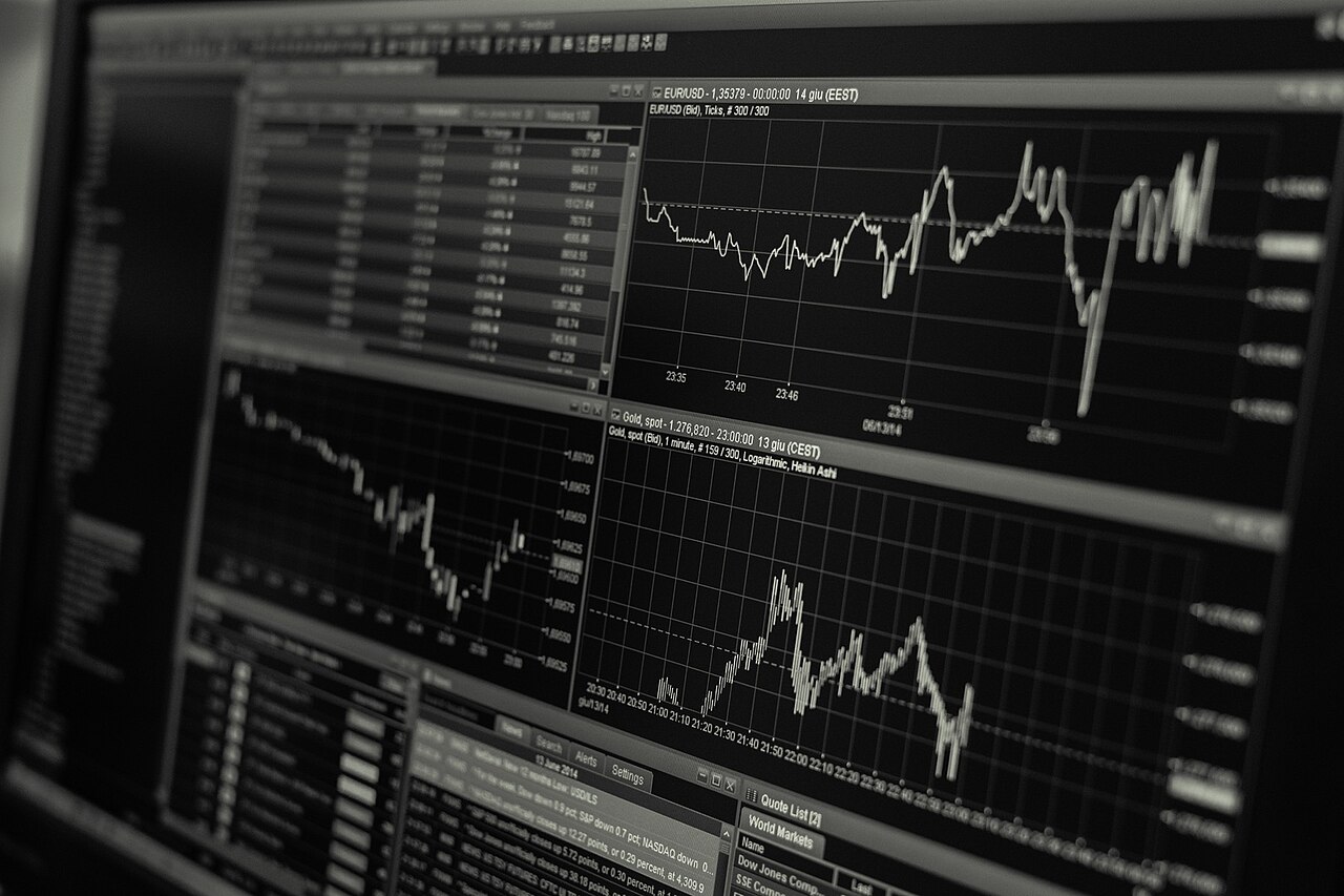
A candlestick chart shows, for each time period, four prices at a glance: the open, high, low and close. Each "candle" is a small shape with a rectangular body and thin lines called wicks. Once you learn to read the body, the wicks and the colour, a chart stops looking like noise and starts telling you the story of who won that period: buyers or sellers. This guide keeps it plain and India-friendly, with no promises about where any price is going next.
Key takeaways
- One candle = open, high, low, close for a chosen time frame (1 min, 1 hour, 1 day, etc.).
- The body shows the open-to-close range; the wicks (shadows) show the extreme high and low.
- Green/white usually means the close was above the open (buyers won); red/black means it closed below (sellers won).
- Patterns like doji, hammer and engulfing hint at momentum shifts. They are odds, not certainties.
- Read patterns in context: trend, support/resistance and volume matter more than any single candle.
The anatomy of a single candle
Every candle has two parts:
- The body: the thick rectangle between the open and the close. A tall body means price moved a lot during the period; a short body means it barely budged.
- The wicks (shadows): the thin lines above and below the body. The top of the upper wick is the period's high; the bottom of the lower wick is the period's low. Long wicks mean price spiked and got rejected.
Colour tells you the direction. In the common convention, a green (or white) candle closed higher than it opened, so buyers were in control. A red (or black) candle closed lower than it opened, so sellers were in control. So a long green body with tiny wicks says buyers pushed hard and held their gains; a small body with long wicks on both sides says the two sides fought to a draw.
Time frames change the whole picture
The same chart looks completely different at different time frames. On a 1-minute chart each candle covers 60 seconds of trading; on a daily chart each candle is one full day. A single day's calm daily candle can hide a wild, spiky story on the 1-minute view. Beginners usually start with the daily or 4-hour view to see the bigger trend, then zoom in for detail. Whatever you choose, be consistent. Comparing a 5-minute candle with an hourly one leads to confusion.
Common single-candle shapes
Doji
A doji has almost no body, because the open and close are nearly equal, and it has wicks on one or both sides. It signals indecision: neither side won. After a strong move, a doji can hint the trend is running out of steam, but on its own it means "pause and watch", not "reverse now".
Hammer and shooting star
A hammer has a small body near the top and a long lower wick. Sellers pushed price down, but buyers dragged it back up by the close. After a downtrend, that rejection of lower prices is often read as a possible bottoming clue. Its mirror image, the shooting star, has a small body near the bottom and a long upper wick, often appearing after an uptrend as a possible topping clue.
Marubozu
A marubozu is a big body with little or no wick. One side dominated the entire period with no pushback. A long green marubozu shows strong buying conviction; a long red one shows strong selling.
Two-candle and multi-candle patterns
Engulfing
A bullish engulfing is a small red candle followed by a larger green candle whose body completely "swallows" it, signalling a possible shift from selling to buying. A bearish engulfing is the opposite: a small green candle overwhelmed by a big red one. Engulfing patterns carry more weight when they appear at a clear support or resistance level.
Support and resistance
Candles cluster around price levels where buyers repeatedly step in (support) or sellers repeatedly cap the move (resistance). Long lower wicks bouncing off the same level, or long upper wicks rejected at the same ceiling, make those levels more meaningful. Patterns near these zones are more reliable than the same pattern in the middle of nowhere.
| Pattern | Shape | Common reading |
|---|---|---|
| Doji | Tiny body, wicks either side | Indecision / possible pause |
| Hammer | Small body up top, long lower wick | Possible bottom after a fall |
| Shooting star | Small body down low, long upper wick | Possible top after a rise |
| Bullish engulfing | Big green swallows prior red | Buyers taking control |
| Bearish engulfing | Big red swallows prior green | Sellers taking control |
| Marubozu | Large body, almost no wick | Strong one-sided conviction |
How to use candles without fooling yourself
- Context first. A pattern in the direction of the existing trend, at a key level, backed by volume, is far more trustworthy than a lone candle.
- Confirmation helps. Many traders wait for the next candle to confirm before acting, rather than reacting to a single shape.
- Candles are odds, not oracles. They describe what already happened and shift probabilities slightly, but they never guarantee the future.
- Protect yourself. No pattern replaces a stop-loss and sensible sizing; read our guide on risk management and position sizing before you trade on any chart.
Candlestick reading is most relevant to active traders. If you are still deciding whether to trade at all, weigh it against a slower approach in our comparison of crypto trading vs investing, and understand the market backdrop through bull vs bear market cycles. If you are just getting started, our beginner's roadmap to crypto trading in India sets the foundations, and the difference between spot and futures trading matters too.
Are green and red always the same on every platform?
Green-up/red-down is the most common convention and is usually the default, but colour schemes can be customised. Always confirm what the colours mean on your chart before relying on them. Check whether green is "close above open" or something else.
Which time frame should a beginner use?
Start with the daily or 4-hour chart to see the broader trend, then zoom in for entries if you trade actively. Very short time frames like 1-minute are noisy and stressful for beginners.
Can candlestick patterns predict the price?
No. They summarise past buying and selling and can shift the odds of the next move slightly. They are a probability tool used alongside trend, levels and volume, and never a guaranteed prediction.
Do I need paid software to read candles?
No. Most exchanges and free charting sites show candlestick charts by default, including live views. You can practise reading them without spending anything.
Want to practise on real data? Open live candlestick charts on our markets page or a specific coin like Bitcoin, see our AI price forecasts for extra context, and keep learning across our crypto guides.
This article is AI-assisted, educational and general in nature. It is not financial advice and never a guarantee of profit. Every trade is at your own risk on your own exchange. See our risk disclosure and editorial policy.